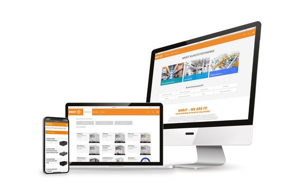
This site is programmed optimally for mobile devices as well as for desktops. In the present time of smartphones and tablets, a responsive web design is a must for an optimum usability even with the best products and most current contents, without the adaptation to mobile devices, a site will loose many users within a short period. Many contents are called up using mobile devices, and who can be bothered to scroll from the left to the right, have to zoom in on texts and diverse buttons, even to miss them after several attempts.
In doing so, the reflection of our User Experience gave us important impulses for the clear menu structure, preferred contents with important links and a clear design of the site.
The current TYPO3 system, which was used to programme the site, has a wide range of options. This allows concepts already planned to be implemented and extensions are also possible in the future. Visitors of the site profit from many features, such as diverse filtering options of the individual production areas. They assume the function of a silent salesperson. The possible selection of products in the form of filler materials, sizes or also according to the areas of application and trades can be limited within a few steps. Visitors are provided with a pre-selection matched to their requirements.
On the site for industrial packagings, with the reusable transport packagings and the plastic pallets for example, our customers have the option to call up data sheets and save or print out files in PDF format. Moreover, you can also direct an inquiry for a proposal to the responsible sales employee.
If one also wants to find out more information about the products and their areas of application, the industry sector pages provide in-depth information. Based on references and examples, an explanation is provided on special features and application areas of the individual products. Direct links to other pages, films or the products addressed make it easier for the users to navigate through the pages, and to direct inquiries to the customer consultation.
An appropriate contact partner for the requirement can be found on each of the product pages as well as via the menu item “Contact”. A filter is also installed here according to product category, country and matter, as service was a first priority for the relaunch of the new WERIT site.
The site also scores in its flexible programming, the internal WERIT concept and the in-house design. As a result, future changes or the content management can be implemented quickly and flexibly. Content, optic and function are continuously coordinated with sales and the customer.
Comments of our customers: “Your site is just like paradise. All containers can be found easily and quickly with a clear overview and with all details”, which confirms that we have made the right choices for the implementation of our homepage. Based on these experiences made, we shall develop the site further as we do not only want to make our digital contents good with the support of our users, we want to make it better.
